Outdoor Photographer RSS Feed
Automated RSS Feed
The color that’s portrayed in a photo has a subconscious impact on the viewer. To analyze every hue and how they impact the brain necessitates a chapter of text. Here’s the abridged version:
The primary focal point of color that captures the eye in a photo conveys a message of the above qualities. The more a single color arrests what’s seen, the greater the message. This got me thinking about a topic for this week’s tip: What if a photographer was to highlight a single color? What if you compose an image where just a small section jumps out but the image real estate of the color doesn’t overwhelm the composition?
To catch a viewer’s attention, a photo should have a key focal point upon which to rest the eye. The stronger that focal point, the easier it is to discern the message of the image. Hand in hand with this, if the focal point has strong color or contrast, it will be prominent. In most cases, that focal point monopolizes the composition. I challenge every reader to make images that support this topic. Create an image where a single color grabs the viewer, but the ground rule is the percentage of real estate it takes is small.
It may be cliched, but red subjects stand out and work well to command attention. Look for subjects with red as they easily enhance many an image. The surrounding colors shouldn’t be complementary due to their similarities. If there are a lot of yellows and oranges, it doesn’t meet the guideline of the task. Look for adjacent colors on the opposite side of the color wheel—blues, aquas and greens.
Green Against Warm

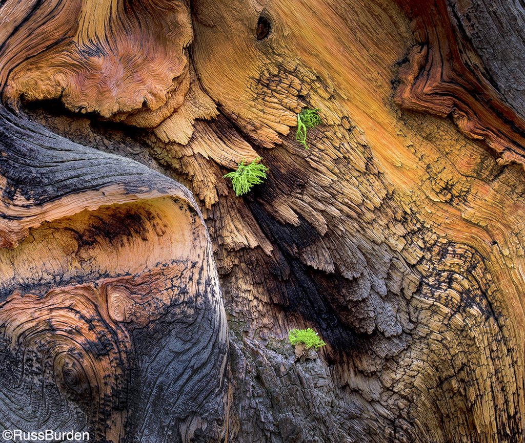
I wandered through the bristlecone pine forest on the road to the summit of Mount Evans in Colorado. It’s not well known by photographers outside the Front Range area, yet it’s one of my favorite places to make images: mountain goats, big horn sheep, the bristlecone pine forest, marmots, pikas, majestic sunrises and sunsets, and so much more. This image fits the theme of this week’s tip in that the green lichen offset against the bark pattern of the bristlecone commands attention: the cool color contrast against the warm background. Additionally, the green represents life and freshness.
Warm Against Cool

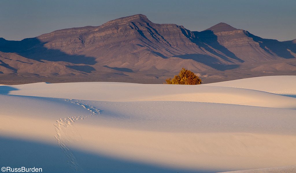
I love to find warm tones that contrast against the cool tones of mountains and blue sky. This was the case when I was in White Sands National Monument in the late fall. Autumn color occurs later in this area as it’s located far south in the United States. I arranged for early entry into the monument so I could be in place when the sun rose over the horizon. The fall color of the cottonwood is another example that demonstrates how a small portion of an image can command attention. This aspect is further reinforced as the footprints across the dunes also grab the eye.
The Purple Offset

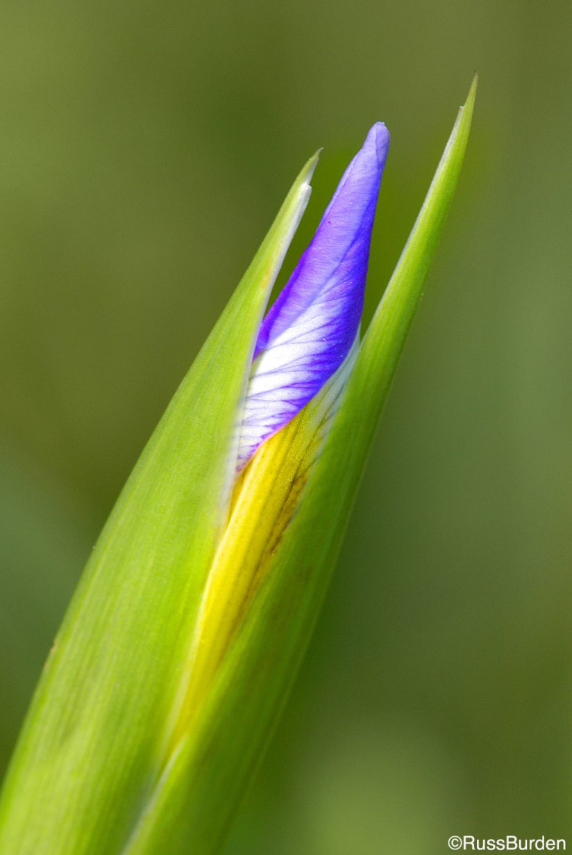
I was wandering the high trails of Colorado in the summer when I came upon a field of iris. Most were in full bloom and proved to be great subjects against the tall peaks of the mountains. As I always profess when I run a safari or nature photo tour, Exhaust All Possibilities. In that I practice what I preach, I swapped my wide angle for a macro, got down to my knees and looked to zero in on something different. After the third knee drop, my eye immediately went to a late budding specimen. I loved the way it stood out from the background and how different it was compared to the others that were in peak bloom. I spun my aperture wide open so the only part that would remain tack sharp was the looming bud. The purple offset against the green allowed it to pop even though the purple makes up less than 10 percent of the image.
Veteran’s Memorial

In the above text, I mentioned red commands attention. I saved this example for the end to prove this point. In comparing the photos used to illustrate this tip, the image real estate made up of red shows the lowest percentage compared to the others yet it commands the strongest attention compared to the others. There are a number of reasons that contribute to this: emotion of the subject matter, it’s the only color that has warmth, its placement against white with cool green tones surrounding it and its location within the image. Keep all these factors in mind when you’re in the field.
Take the challenge of this week’s tip to find images where a small portion of the composition grabs attention. Look for color contrast along with size relationships. It will open your eyes to a new world of seeing.
Visit www.russburdenphotography.com for information about his nature photo safaris to Tanzania.
The post Communicate With Color In Your Photography appeared first on Outdoor Photographer.
Continue reading...
- Blue: tranquility, peacefulness, confidence
- Yellow: warmth, caution, energy
- Green: life, freshness, growth
- Purple: luxury, passion, wisdom
- Red: danger, heightened emotion, excitement, love
- Black: mystery, horror, power
- White: hope, purity, simplicity
The primary focal point of color that captures the eye in a photo conveys a message of the above qualities. The more a single color arrests what’s seen, the greater the message. This got me thinking about a topic for this week’s tip: What if a photographer was to highlight a single color? What if you compose an image where just a small section jumps out but the image real estate of the color doesn’t overwhelm the composition?
To catch a viewer’s attention, a photo should have a key focal point upon which to rest the eye. The stronger that focal point, the easier it is to discern the message of the image. Hand in hand with this, if the focal point has strong color or contrast, it will be prominent. In most cases, that focal point monopolizes the composition. I challenge every reader to make images that support this topic. Create an image where a single color grabs the viewer, but the ground rule is the percentage of real estate it takes is small.
It may be cliched, but red subjects stand out and work well to command attention. Look for subjects with red as they easily enhance many an image. The surrounding colors shouldn’t be complementary due to their similarities. If there are a lot of yellows and oranges, it doesn’t meet the guideline of the task. Look for adjacent colors on the opposite side of the color wheel—blues, aquas and greens.
Green Against Warm
I wandered through the bristlecone pine forest on the road to the summit of Mount Evans in Colorado. It’s not well known by photographers outside the Front Range area, yet it’s one of my favorite places to make images: mountain goats, big horn sheep, the bristlecone pine forest, marmots, pikas, majestic sunrises and sunsets, and so much more. This image fits the theme of this week’s tip in that the green lichen offset against the bark pattern of the bristlecone commands attention: the cool color contrast against the warm background. Additionally, the green represents life and freshness.
Warm Against Cool
I love to find warm tones that contrast against the cool tones of mountains and blue sky. This was the case when I was in White Sands National Monument in the late fall. Autumn color occurs later in this area as it’s located far south in the United States. I arranged for early entry into the monument so I could be in place when the sun rose over the horizon. The fall color of the cottonwood is another example that demonstrates how a small portion of an image can command attention. This aspect is further reinforced as the footprints across the dunes also grab the eye.
The Purple Offset
I was wandering the high trails of Colorado in the summer when I came upon a field of iris. Most were in full bloom and proved to be great subjects against the tall peaks of the mountains. As I always profess when I run a safari or nature photo tour, Exhaust All Possibilities. In that I practice what I preach, I swapped my wide angle for a macro, got down to my knees and looked to zero in on something different. After the third knee drop, my eye immediately went to a late budding specimen. I loved the way it stood out from the background and how different it was compared to the others that were in peak bloom. I spun my aperture wide open so the only part that would remain tack sharp was the looming bud. The purple offset against the green allowed it to pop even though the purple makes up less than 10 percent of the image.
Veteran’s Memorial
In the above text, I mentioned red commands attention. I saved this example for the end to prove this point. In comparing the photos used to illustrate this tip, the image real estate made up of red shows the lowest percentage compared to the others yet it commands the strongest attention compared to the others. There are a number of reasons that contribute to this: emotion of the subject matter, it’s the only color that has warmth, its placement against white with cool green tones surrounding it and its location within the image. Keep all these factors in mind when you’re in the field.
Take the challenge of this week’s tip to find images where a small portion of the composition grabs attention. Look for color contrast along with size relationships. It will open your eyes to a new world of seeing.
Visit www.russburdenphotography.com for information about his nature photo safaris to Tanzania.
The post Communicate With Color In Your Photography appeared first on Outdoor Photographer.
Continue reading...
